Help Wanted
Pixel Art Help – LegaianLight
|
LegaianLight Member Posts: 71 From: Colorado, United States Registered: 04-04-2006 |
Hey folks, i started a new site (saltandlight.wikidot.com) and i posted my pixel art there. It's not much right now, but i would appreciate any constructive criticism that anyone could offer. Even if you dont think you know much about pixel art, any suggestions would be great. It's mainly for 16x16 tiles or 16x24 characters, and so far i only have 16x16 tiles. I appreciate any help you can offer! Thank you! ------------------ |
MastaLlama Member Posts: 671 From: Houston, TX USA Registered: 08-10-2005 |
Looks great! You should make a few sheets though to show off how it looks together with the grass, walls and trees all in 1 image. |
|
HanClinto Administrator Posts: 1828 From: Indiana Registered: 10-11-2004 |
Hey Legaian! Nice start! I didn't take time to tile very many of them, I just focused on the brick ones. The trees don't have much contrast to them, and it's hard for me to see much definition. A hilight color to draw out the bark could possibly help here. Thanks for sharing! Keep up the good work! --clint [This message has been edited by HanClinto (edited July 05, 2007).] |
|
LegaianLight Member Posts: 71 From: Colorado, United States Registered: 04-04-2006 |
Wow, thank you for the help already! Llama - Gread idea! thank you. will do, ill get on that as soon as im done taking apart this house and putting it into tiles. Han - Thank you for your feedback, first of all. I should have given an explaination, though, but hey, thats one way to learn. Brick is kind of the generic brick tile that is for tiling throughout the body of a building. BrickW is the beginning of the rounded corner for the west side, and brickW1 is the final rounding. Ill post a picture on my site to let you know what i was intending. Also, i agree that the brick tile is a little plain. When i was working between a few different computers, i lost track of what was where, so i do have some variations somewhere. I'll get on adding some variation to the set on this computer soon. Thanks a lot, and keep them coming! Check back later and ill hopefully have taken care of some of what you each have pointed out!
------------------ [This message has been edited by LegaianLight (edited July 05, 2007).] |
|
samw3 Member Posts: 542 From: Toccoa, GA, USA Registered: 08-15-2006 |
Are you just starting out as a pixel artist? This is a good start.  Here is my critique. Here is my critique.  Regarding the pixel work: From the angle of art and reality: Also, I'll throw in a pointer could have saved me frustration when I was attempting a 2D rpg back in the day. Maps are always drawn in layers! At the least, a foreground and background layer (sometimes a third if you are doing covered bridges). If there is something that the player walks behind, you need to draw two tiles one for underneath the player and one for above the player. I still remember when this dawned on me after spending like a month making a tile set, then having to redo more than half of the tiles... very frustrating. A very revealing exercise is to download zsnes and your fav 2d rpg rom, then use the 1,2,3,4,5 keys to toggle the layers on and off and see how the pros do it. But, I encourage you to stick with it and do well. God Bless! ------------------ |
buddboy Member Posts: 2220 From: New Albany, Indiana, U.S. Registered: 10-08-2004 |
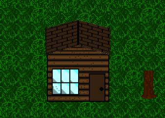
hey pretty cool LL. good job for somebody just starting. one thing: the brick wall is at a different angle than the houses. maybe it's just the roofs (because now looking at it, the front faces are the same) that make it look weird. if the roofs weren't so long and didn't seem to angle straight up it would look more realistic. just a tip. otherwise looks pretty cool. you working on a game? ------------------ |
buddboy Member Posts: 2220 From: New Albany, Indiana, U.S. Registered: 10-08-2004 |
BTW (sorry about double post) I tried my hand at fiddling with your house and here's what I came up with: I know it's only somewhat better (at least in my opinion) but it was just a quick thing and I wasn't redrawing the whole image (which would be the best way to fix it). I just made the roof wider and shorter and set it on the house. A better way to show it would be to make the tiles thinner and such. also you really shouldn't be showing much of the roof from the angle you're drawing it. it's tough. ------------------ |
|
Lava Member Posts: 1905 From: Registered: 01-26-2005 |
Budd that looks totally awesome!! We should really have a Pixel Art dump thread |
|
LegaianLight Member Posts: 71 From: Colorado, United States Registered: 04-04-2006 |
Alright, time for an update! So, lets start with the bricks. I smoothed some things out again in getting the color palette straight and continuous. I also added in a few variations for some of the tiles, specifically adding cracks. The House - i didnt do a lot, exactly, but i did change the shading so it doesnt look quite so plain. As far as extending the roof, ill definitely take that into consideration. I was considering making this a poorer characters house and leaving the eaves off and even adding a hole in the roof or something. But ill do the eves on future houses that are for even somewhat richer characters. Grass - I decided to try a different look, hopefully eliminating any circles that may have been in the old ones. I intend to add a third tile, since i only have 2 right now. Buddboy - I am working on a game, but i think i'm going to start with a sprite storyboard (like a sprite comic but for the purpose of storyboarding), that way most of the art assetts will be in order before hand. As far as the roofs go, ill have to do some looking and thinking. It will probably help more when i have more examples, especially off buildings, so that things will be more continuous and not look so strange! lol In any case, the page has been updated with a new scene. It has two new tree styles, the new house, and the new brick wall (west side, plus curve, and a bit of a roof). The brick wall is unfinished, though. ------------------ |
|
samw3 Member Posts: 542 From: Toccoa, GA, USA Registered: 08-15-2006 |
Wow. This is quite an improvement! I think I'll post a copy here so others can see it. Wall: Grass: House: Trees: Color: All in all, this is great progress! Keep up the good work. I look forward to seeing this progress more! God Bless! ------------------ [This message has been edited by samw3 (edited July 11, 2007).] |
buddboy Member Posts: 2220 From: New Albany, Indiana, U.S. Registered: 10-08-2004 |
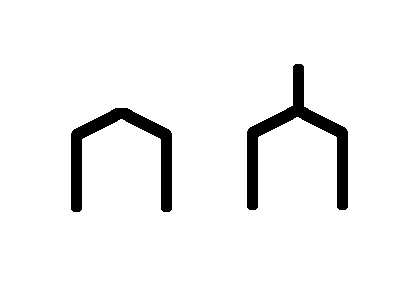
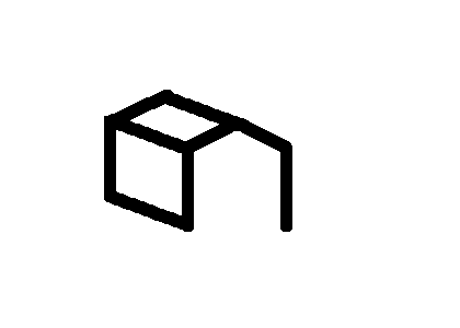
yeah I sort of see what you're saying samw3. and looking at the new version with the top on the wall, you're being consistent with the angles so at least there isn't a difference. but it still would look different. I'm going to draw a quick house in GIMP to show what I mean... see, the one on the left is a house from the front, and the one on the left is what you're doing. now either you can not show the roof (but a view like that almost never happens in life) or you can show everything from an angled view so you can see the side of the house and the roof. like this: ------------------ |
|
samw3 Member Posts: 542 From: Toccoa, GA, USA Registered: 08-15-2006 |
You bring up a good point as well buddboy, but I believe it a matter of preference and artistic style. Its called the projection. The lower of your designs is call an Isometric projection and LL's design is more of an oblique projection. Both have been used successfully in 2D video games. An oblique projection can be a bit harder to draw if you have very tall items, and maybe this is the LL's struggle with the wall. Most games that have tall items in an oblique projection make it go off the screen (like the wall in the zelda shot below). Oblique (Zelda): Isometric (DOFUS Arena): ------------------ |
jestermax Member Posts: 1064 From: Ontario, Canada Registered: 06-21-2006 |
hey now, i think i'll toss in my vote about whatever we're talking about  (no, i haven't read every post :P) (no, i haven't read every post :P)First of all: the house you might consider having the roof panels go to other way (similar to how it's done in Link to the Past). Also, you should decide now about your style; the black lines aren't a bad thing unless it conflicts with the style you're trying to hit. I like the cel shaded look in some games, which gives it a stylistic, comic book feel. The graphics are somewhat simpler to make as you don't have to hit realism but more just your personal style. On the other hand though, if realism is your target then i'd suggest blending a some colours to use as outlining, especially if you want to involve lighting (colours are lighter when light hits them :P). As for the top of the castle: it looks like you're trying to show depth there by shrinking the tiles. I wouldn't suggest doing that unless it's a solid background image. The roof of the house really sets up the scene so i'd aim for at least the depth of the house. Again, i may have covered stuff that other people said so sorry. keep up the good work though! ------------------ |
buddboy Member Posts: 2220 From: New Albany, Indiana, U.S. Registered: 10-08-2004 |
yeah, I do see what you're saying about it being oblique. but it doesn't even look oblique, per se. the front of the house would have to be shortened or drawn from a slightly different angle. yeah and you are right about the wall going of screen. I guess I didn't think about him going for the oblique look =P well, whatever you think looks best LL. that's the important part. ------------------ |
|
LegaianLight Member Posts: 71 From: Colorado, United States Registered: 04-04-2006 |
Samw3 - For the wall, the top is supposed to be a floor that people could walk on. I dunno exactly how to make it look like what i want it to though. Its supposed to look like a castle column/ defensive tower that you might see at a corner of a castle. Grass - I added a third tile in my own personal collection, and ill post it soon. House - Yeah, i see what you mean about the black outlines. I'll look into editing that out soon. As far as adding texture to the shingles, i dont know exactly what to do other thatn make a few look broken for this house (it's supposed to be for more of a poor persons house). Trees - Yeah, i understand about the branches. I'll see what i can do about that. Thanks for the link, it looks interesting! Color - Thanks for the compliment! yeah, this is supposed to look a lot more drab as its near a forest and the darkness is supposed to be partially because of the influences of the town (demonic). Also, as for your more recent post, i appreciate that. I was going for more of an oblique projection.
I am going for more of a realistic look, but im just getting started so i do intend to work on the colors and shading, and will continue to appreciate any constructive criticism, so thank you For the castle, i was trying to show some depth, but i get what your saying about the house setting the depth for the scene. I'll get on that soon hopefully
------------------ |
jestermax Member Posts: 1064 From: Ontario, Canada Registered: 06-21-2006 |
Well if you think about it, the shingles on a house move from left to right (or vice versa) and then you move up one layer and continue the pattern. so that gives you horizontal rows running parallel to the top of the house ( so when it rains the rain drips off and doesn't pool on the roof). the way it is in the image, it looks like the side of a brick wall. if you want i can email an image of what i mean but i think the Zelda image displays it adequately (rows parallel to the roof). i like your trees too, but i'd suggest adding some outline to the branches so they stand out more. and thanks for taking it as constructive criticism  (thats what it's supposed to be) (thats what it's supposed to be)------------------ |
|
LegaianLight Member Posts: 71 From: Colorado, United States Registered: 04-04-2006 |
Ah, i gotcha. I dont know if i had thought about that, but that does make a lot of sense. No, i dont think you need to email me an image, but i do appreciate the offer. Yeah, i'm working on something that will make them stand out more as we speak. Thanks again, everyone, and keep it coming Edit: Also, does anyone know of a good tile mapper for Mac? I have one called Reptile, but i'm looking for something that supports layers, different sized tiles, and still places by tile as opposed to by pixel Edit 2: I have updated the pixel art section of my page with a new picture of some of the work for today. It was rough, but its a huge praise God that we did it ------------------ [This message has been edited by LegaianLight (edited July 13, 2007).] [This message has been edited by LegaianLight (edited July 13, 2007).] |
|
LegaianLight Member Posts: 71 From: Colorado, United States Registered: 04-04-2006 |
Alright everyone! So I've redone the houses so they not only have extended eaves but so that they are a bit better perspectively. Also, the roofs are now better looking in the shingles, in my opinion. I have yet to add texture to the roof outside of the shingles, but that will come soon, hopefully. I did add in a third grass tile, and i also started working on a sprite version of myself (which is shown in the most recent picture. Also, and a little off topic, i added a links section which i wouldnt mind any feedback on as well. Thanks a lot! One last question, and idk if this should be put elsewhere - are we allowed to bump topics like im doing now? ------------------ We're standing on the shores of forever - where stars are shining brighter than before. And peace is the Prince of the moment. Our hearts are so weary from the war. Who is on first. ~ Well what are you asking me for? |
|
PointOfLight Member Posts: 60 From: Indiana, USA Registered: 11-26-2001 |
Sorry for the stupid question, but I went to your web site and didn't see any pixel art. Where can I find it? ------------------ |
|
LegaianLight Member Posts: 71 From: Colorado, United States Registered: 04-04-2006 |
Sorry about that! I recently took down that page, at least for a while, because I came across some information about Deriving art, and that that is copyright infringement. While i dont think i was doing that with the backgrounds (i suppose arguably the grass was), the sprite art i was hoping to do might have been considered Derived. I apologize and would appreciate any input on that subject as well. So for right now, its back to the writing stage until i can figure out where to go from here. ------------------ We're standing on the shores of forever - where stars are shining brighter than before. And peace is the Prince of the moment. Our hearts are so weary from the war. Who is on first. ~ Well what are you asking me for? |
evdude Member Posts: 135 From: Earth Orbit Registered: 03-14-2007 |
quote: I have one called Mappy, and it does all of that, plus isometric and hexagon maps and lots more. I don't know if it runs on mac, and the site is down('Bandwidth Limit Exceeded') so I can't check. hope that helps!
"trust in the lord with all your heart and lean not on your own understanding, in all your way's, acknowledge him and he will direct your path" proverbs 3:5-6 [This message has been edited by evdude (edited July 30, 2007).] |


