
|
HanClinto Administrator Posts: 1828 From: Indiana Registered: 10-11-2004 |
Hey all! Well I've been working on MITE for a while, and stuff is progressing well! I was really encouraged at the CGDC to really market MITE and make it something attractive to people -- give it a brand name, license it, really do it right. One thing I need right now is art. "Did he say 'art'? I thought it was a text-based game." That's right, I said art. Nothing fancy, though I'd like to have a graphical logo for it on the webpage. One thing I was thinking of was trying to get a couple of different logos -- all in different styles. So one medieval, one futuristic, one cutesy, one anime, etc etc etc, and have them all rotate via a php script on the main page, just to illustrate the diversity of games that can be created with the engine. Again, MITE stands for "MUD In The Eyes" as a reference to Jesus opening the eyes of the blind, it also is very small (like a mite), it's an offering to God (as in the Widow's Mite), and it's very powerful (hominym with Might). I'm not as good as Ashton_JX or Kiwee or Cheybea at drawing, but here's an ascii logo I made:
I think it's a much improved version over the old one:
I'm not sure if there is enough interest for there to be a "logo contest", but if anyone's interested, I would love to see what you can come up with. Whaddya' think? --clint ------------------ |
||
en972 Member Posts: 562 From: NOT TELLING! Registered: 08-27-2004 |
Hey Clint! I don't know if you e mailed me back because I currently changed my email. It is reaganmeister@gmail.com ------------------ |
||
|
Ashton_JX Member Posts: 156 From: Springfield, Oregon, USA Registered: 02-21-2005 |
Wow, MITE sure does stand for a whole lot of stuff. ------------------ New Living Translation |
||
crazyishone Member Posts: 1685 From: Registered: 08-25-2004 |
hey i put something 2gether u mite be able to use somewhere.... im not sure tho...its not realy a logo...closer to a banner than anything else, but it isnt 468x60....im not sure, but i think it looks pretty cool. I could use some more work, but anyways....its here (globalrant.tk)
btw...its crazy-ish-one [Crazyishone didnt like what his post sed before, so he was like "heck, I'll change it!!!] [This message has been edited by crazyishone (edited August 08, 2005).] |
||
|
crazyishone Member Posts: 1685 From: Registered: 08-25-2004 |
looking at it closely...the "M" could use some work....a few touch-ups here and there would be good... ------------------ [This message has been edited by crazyishone (edited August 08, 2005).] |
||
|
HanClinto Administrator Posts: 1828 From: Indiana Registered: 10-11-2004 |
Sweet! Thanks, crazyishone!  I like the style of it, and I would definitely be interested in seeing a touched-up version. Either way, impressive, thanks! --clint ------------------ |
||
|
kiwee Member Posts: 578 From: oxfordshire, england Registered: 04-17-2004 |
hows about this: just a quicky ------------------ |
||
|
HanClinto Administrator Posts: 1828 From: Indiana Registered: 10-11-2004 |
oooOOOOooo -- looks neat Kiwee! <right-click, saves> Its off-centeredness feels a little wierd, and the letters look 3D from the front, but turned on an angle like that, they seem billboardish (thin). Still, it looks good! Thanks! --clint ------------------ |
||
|
crazyishone Member Posts: 1685 From: Registered: 08-25-2004 |
noice....very noice.... wat did u make that with? ------------------ |
||
D-SIPL Moderator Posts: 1345 From: Maesteg, Wales Registered: 07-21-2001 |
12 seconds The Gimp ------------------ |
||
|
en972 Member Posts: 562 From: NOT TELLING! Registered: 08-27-2004 |
Nice, gimp rocks ------------------ |
||
|
HanClinto Administrator Posts: 1828 From: Indiana Registered: 10-11-2004 |
Nice, D-Sipl! Thanks! I really like that glow effect. ------------------ |
||
|
crazyishone Member Posts: 1685 From: Registered: 08-25-2004 |
all i can say is...flippin sweet. im trying to figure out wat u did...i think i know. we shoudl make this into a contest. it certainly wouldn't hurt u, HanClinto.lol. ------------------ [This message has been edited by crazyishone (edited August 08, 2005).] |
||
|
D-SIPL Moderator Posts: 1345 From: Maesteg, Wales Registered: 07-21-2001 |
Open Gimp, go to Script-Fu and choose glowing hot or something. --D-SIPL ------------------ |
||
|
crazyishone Member Posts: 1685 From: Registered: 08-25-2004 |
so...somehting like this(below) can be done in a few seconds. i nvr noticed the script-fu thingy....anyways, this is another one I made. ------------------ |
||
|
Braveheart Junior Member Posts: 1 From: Washington State Registered: 08-09-2005 |
Umm, to be honest with you, I could make you all of those for you. I am a webartist and graphic desinger. I do all my work for free. If your interested you can message me on AIM. yxtheduckxy thanks, |
||
|
crazyishone Member Posts: 1685 From: Registered: 08-25-2004 |
hey....i know this guy personally, asked him to hlep u out. here is a sapmle of his work. he did this, not me, for the record. ------------------ |
||
|
kiwee Member Posts: 578 From: oxfordshire, england Registered: 04-17-2004 |
quote: my genius  and abit of Corel's Art Package sprinkled on top   ------------------ [This message has been edited by kiwee (edited August 09, 2005).] |
||
|
HanClinto Administrator Posts: 1828 From: Indiana Registered: 10-11-2004 |
Wow, thanks guys! Braveheart, welcome to CCN! I'll be messaging you. Thanks for the recommendation, Crazyishone! Thanks Kiwee! You do good stuff. I really appreciate this y'all -- it's really good! --clint ------------------ |
||
|
kiwee Member Posts: 578 From: oxfordshire, england Registered: 04-17-2004 |
miteicon3: ------------------ [This message has been edited by kiwee (edited August 09, 2005).] |
||
|
HanClinto Administrator Posts: 1828 From: Indiana Registered: 10-11-2004 |
hardee har harr. ------------------ |
||
|
crazyishone Member Posts: 1685 From: Registered: 08-25-2004 |
thats cool...hanclinto, u sed u are looking for a logo...so do you want it to be like a symbol or character (like the spider thing in kiwee's post)...or do you want ti to be like and image>?>?>?>? ------------------ |
||
|
HanClinto Administrator Posts: 1828 From: Indiana Registered: 10-11-2004 |
I dunno' -- that's actually a good point about wanting a logo/character/mascot. I hadn't thought of that -- interesting! I didn't originally intend to have a character-based logo, but the more I think about it, the more I think that could be kind of cool! Kiwee's bug looks more like a spider than a mite, but I wonder if we could get a cute looking mite insect to represent the engine without being too creepy. Hrm, interesting thoughts guys -- I like it! Thanks so much! --clint ------------------ |
||
|
en972 Member Posts: 562 From: NOT TELLING! Registered: 08-27-2004 |
I like kiwees mite thing ------------------ |
||
|
HanClinto Administrator Posts: 1828 From: Indiana Registered: 10-11-2004 |
Heh. In a meeting today at work, I kept doodling little mite bugs on my paper, thinking about this. :-D I'm interested in seeing what kind of mite people can come up with. --clint ------------------ |
||
|
crazyishone Member Posts: 1685 From: Registered: 08-25-2004 |
 well, there's a start....its so much easier for me to make text look cool than it is to freehand an actual character...but this is what i threw together. (perhpas i can do better....lol) ------------------ |
||
|
D-SIPL Moderator Posts: 1345 From: Maesteg, Wales Registered: 07-21-2001 |
I was bored in my lunch break so here ya go, again this is very quick and only for jokey purposes :P --D-SIPL ------------------ [This message has been edited by D-SIPL (edited August 11, 2005).] |
||
|
HanClinto Administrator Posts: 1828 From: Indiana Registered: 10-11-2004 |
lol. Crazyishone and D-Sipl -- both of yours are very funny (though both in different, but good ways). Thanks! That's hilarious -- hah. This is great, thanks so much! --clint ------------------ |
||
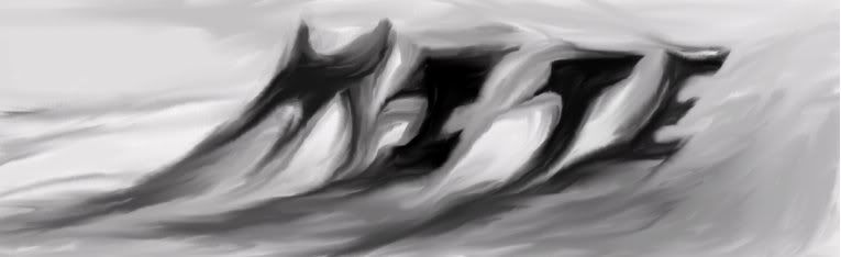
CoolJ Member Posts: 354 From: ny Registered: 07-11-2004 |
obviously im not an artist I did this with truespace. the idea is suppose to be a mite bending the word 'mite' like he is bending a bar of metal to show his strength. however he probaby could use some muscles and a real artists touch. I just liked the concept. [This message has been edited by coolj (edited August 16, 2005).] |
||
|
HanClinto Administrator Posts: 1828 From: Indiana Registered: 10-11-2004 |
lol! Coolj, that's hilarious! This whole time, I thought Mites had 6 legs and were insects, turns out they're like ticks and spiders and other arachnids and have 8 legs. Good job on getting it right while I got it wrong! That's too funny though, Coolj. Here's one I did this morning in Microsft Paint, because I didn't think I would have any icons in time for the release: I think yours looks fantastic! I don't know what you're talking about that you're "obviously not an artist" -- I know I'm obviously less of an artist than you. --clint ------------------ [This message has been edited by HanClinto (edited August 16, 2005).] |
||
|
kiwee Member Posts: 578 From: oxfordshire, england Registered: 04-17-2004 |
quote: if you send me a .x3d of this, i might be able to pimp it up ------------------ |
||
|
CoolJ Member Posts: 354 From: ny Registered: 07-11-2004 |
quote: Thanks! I've never been complimented on my art before! here's mity mite again after a good breakfast of Suger Frosted Skin Flakes(tm) Theerrreee Grrrrreat!! hahaha! |
||
|
CoolJ Member Posts: 354 From: ny Registered: 07-11-2004 |
quote: ok! that would be cool kiwee! I'll send you the new one, let me see if I can export it as x3d. |
||
|
HanClinto Administrator Posts: 1828 From: Indiana Registered: 10-11-2004 |
heh, sweet. Do you think I could also have one without the MITE lettering so that I could shrink it down for the icon? (the text wouldn't be readable, but the bug would look cool) Great stuff! Thanks! :-D --clint ------------------ [This message has been edited by HanClinto (edited August 16, 2005).] |
||
|
CoolJ Member Posts: 354 From: ny Registered: 07-11-2004 |
Here he is without the text
[This message has been edited by coolj (edited August 16, 2005).] |
||
|
HanClinto Administrator Posts: 1828 From: Indiana Registered: 10-11-2004 |
Excellent, thanks! I'll shrink it down and make it into an icon, and I'll probably include it in this Friday's release. --clint ------------------ |
||
|
kiwee Member Posts: 578 From: oxfordshire, england Registered: 04-17-2004 |
@coolj: Can you do .3ds, .ndo, .ai, or .obj? ------------------ |
||
|
CoolJ Member Posts: 354 From: ny Registered: 07-11-2004 |
quote: ok I was able to convert it to .3ds, I dont have a place to post it but if you email me at chrisjspencer[at]gmail.com, I reply with it attached. I zipped, its ~88k. [This message has been edited by coolj (edited August 17, 2005).] |
||
|
en972 Member Posts: 562 From: NOT TELLING! Registered: 08-27-2004 |
I messed around with some graphics. Just an idea. and ------------------ |
||
|
kiwee Member Posts: 578 From: oxfordshire, england Registered: 04-17-2004 |
quote: i have sent you an email @en: umm...you can't really see that it says mite in that, perhaps you could weaken it abit ------------------ |
||
|
CoolJ Member Posts: 354 From: ny Registered: 07-11-2004 |
I made him mitey cute! let me know if you like him better. kiwee, I'll send you then new model too! |
||
|
en972 Member Posts: 562 From: NOT TELLING! Registered: 08-27-2004 |
Yeah I am going to have to make it more visible. I'm new to graphics. ------------------ |
||
|
CoolJ Member Posts: 354 From: ny Registered: 07-11-2004 |
[This message has been edited by coolj (edited August 18, 2005).] |
||
|
HanClinto Administrator Posts: 1828 From: Indiana Registered: 10-11-2004 |
CoolJ: That looks great too! Thanks so much! It's fantastic stuff! @ En: I like the idea! I agree, the swirl makes it a little impossible to tell if there is stuff underneath there, but I think it looks very cool nonetheless! Thanks! --clint ------------------ |
||
|
CoolJ Member Posts: 354 From: ny Registered: 07-11-2004 |
thanks! ok, i'm done now i promise but if you decide to go with mini mite, here's his shot without the text: |
||
|
en972 Member Posts: 562 From: NOT TELLING! Registered: 08-27-2004 |
I'm still not done!
------------------ |
||
|
HanClinto Administrator Posts: 1828 From: Indiana Registered: 10-11-2004 |
You're done now CoolJ? Awww -- I like seeing all of your various things. The smile on Mini Mite might be a little overdone, but he's still quite good -- for now, I think I'll iconify him and use him for the release. Thanks! Thanks for the logos, En! --clint ------------------ |
||
|
CoolJ Member Posts: 354 From: ny Registered: 07-11-2004 |
quote: thanks! i guess he's a really happy little mite! I don't know much about creating windows icons, but here he is as a 32x32 256 color gif |
||
|
HanClinto Administrator Posts: 1828 From: Indiana Registered: 10-11-2004 |
Rock on, CoolJ! He's now iconified, and lookin' spiffy! --clint ------------------ |
||
|
en972 Member Posts: 562 From: NOT TELLING! Registered: 08-27-2004 |
This is my latest ah Just made another. Though This isn't really my version. My friend took a graphic of mine and pimped it out Ah another one. this one is really simple [This message has been edited by en972 (edited August 18, 2005).] [This message has been edited by en972 (edited August 18, 2005).] [This message has been edited by en972 (edited August 18, 2005).] |
||
|
en972 Member Posts: 562 From: NOT TELLING! Registered: 08-27-2004 |
I'm working on one last image. Can someone give me some advice to make it more flashy? ------------------ |
||
|
kiwee Member Posts: 578 From: oxfordshire, england Registered: 04-17-2004 |
firstly they are all too big try to scale them down abit ------------------ |
||
|
kiwee Member Posts: 578 From: oxfordshire, england Registered: 04-17-2004 |
here is a template logo i made to explain something on a forum somewhere i made it in 5 mins  you could use that ------------------ |
||
|
en972 Member Posts: 562 From: NOT TELLING! Registered: 08-27-2004 |
What kind fo company calls themselves, "Companyname" Just messing with ya ------------------ |
||
|
Lava Member Posts: 1905 From: Registered: 01-26-2005 |
Here's one: I wanted to go for a more simple look. And I actually based the bug off a picture I found of a House Dust Mite under a microscope, the only thing I didn't put in were two small arms up on the front, but you wouldn't be able to see them anyway. ------------------ |
||
|
HanClinto Administrator Posts: 1828 From: Indiana Registered: 10-11-2004 |
I already told Lava this over IM, but I *really* like the simplicity of that design -- I also really like that shade of blue. It goes very nicely with CoolJ's MiniMite, and I haven't decided which one I like better yet as a mascot. I like the simplicity of this one so much that I actually changed my desktop to it right after Lava sent it to me. I've really been appreciating all of the graphics everyone has done for this -- it's really been a huge blessing, and I'm very grateful for it. Thanks so much! --clint ------------------ |
||
|
Realm Master Member Posts: 1971 From: USA Registered: 05-15-2005 |
tisktisktisk... (i'm tisking myself, FYI) i wish i could to 2d stuff like that... all i have is the stupid paint... (its REALLY hard to make anything good with paint..) ah, well, gfx is not my biggest problem... right now C++ is my biggest probelm... or more speicifically intergrating the irrchilit gfx llibrary is... its going fine and i have done some 3d (very little) stuff but im leaning towards a 2d game right now... but there is one problem... does anyone know if irrlichit has a 2d collision test? wow... i like all the work i've seen... you have a hard choice ahead of you Han... ------------------ Blessed are those who show mercy. Blessed are those who suffer for doing what is right. |
||
|
HanClinto Administrator Posts: 1828 From: Indiana Registered: 10-11-2004 |
Yeah, these graphics are all so good, it certainly is a hard choice to decide between them all. As far as the irrlicht 2d collision detection, I imagine what might be easiest is to make your 2d sprites be 3d objects (even if they're just billboards -- which are flat surfaces in 3d space), put them all on the same z-plane (the same height), and then use the normal 3d collision detection? In case you're curious, Lava used Paint to create the above graphic -- if you notice, the body of the mite is a perfect ellipse, and all of the legs were hand-drawn with Paint and filled in with the paint bucket. The only thing he used something other than Paint for was to make the text bigger (and he probably could have used Paint for that even, but it was easier to use the other thing). Cheers! ------------------ |
||
|
kiwee Member Posts: 578 From: oxfordshire, england Registered: 04-17-2004 |
[edit] [This message has been edited by kiwee (edited August 31, 2005).] |
||
|
CoolJ Member Posts: 354 From: ny Registered: 07-11-2004 |
aaahhh, yes! I like lava's mite logo. Very nice and simplistic. I think my MityMite is just a weee bit too happy, but he sure is cute! [This message has been edited by coolj (edited August 31, 2005).] |
||
|
Lava Member Posts: 1905 From: Registered: 01-26-2005 |
Well it was thanks to God who gave me the ability to draw, and to Kiwee who started with an icon and coolj who had the idea to make the mite bug blue. ------------------ [This message has been edited by lava (edited August 31, 2005).] |
||
|
HanClinto Administrator Posts: 1828 From: Indiana Registered: 10-11-2004 |
I like the MiniMite! (or is he MityMite now -- I dunno -- I like them both, but I'll prolly call him MiniMite). I dunno' if he's too happy or not, but I agree, he sure is cute. He's staying as the icon right now, so he'll be around for a while to come. Speaking of colors and graphics and stuff, Mite got syntax hilighting for scripts last night! ------------------ |
||
|
kiwee Member Posts: 578 From: oxfordshire, england Registered: 04-17-2004 |
looks great ------------------ |
||
|
en972 Member Posts: 562 From: NOT TELLING! Registered: 08-27-2004 |
OH YAY! And more good news.. I"M WORKING ON PROTING MITE TO LINUX! WOOT! ------------------ |
||
|
HanClinto Administrator Posts: 1828 From: Indiana Registered: 10-11-2004 |
Yay! One of the first major hurdles will be getting the database out of Microsoft Access and into SqlLite. The next hurdle will relate to the IDE, as it's all written in System.Windows.Forms, and I'm not sure if Mono's MWF implementation is complete enough to handle the treeviews and the richtextbox. If nothing else, it might not be a bad idea to rewrite the IDE in GTK#, and then it's cross-platform much more easily. ------------------ |
||
|
Lava Member Posts: 1905 From: Registered: 01-26-2005 |
Here is an updated version of it. It changed it a little bit, and the reason I made it red was because it looked alot like a spider. But I also made a blue one. ------------------ [This message has been edited by lava (edited September 02, 2005).] |
||
|
HanClinto Administrator Posts: 1828 From: Indiana Registered: 10-11-2004 |
whoaa -- creepy! I had no idea their front legs were so long! ------------------ |
||
|
Lava Member Posts: 1905 From: Registered: 01-26-2005 |
Oh sorry if it was a little bit too much, with the red and all. Han, which one do you like better, the first one or this one? ------------------ |
||
|
HanClinto Administrator Posts: 1828 From: Indiana Registered: 10-11-2004 |
I like how the first one looks less like a spider, and a little less creepy. Though I like the body of this new one better --clint ------------------ |
||
|
Lava Member Posts: 1905 From: Registered: 01-26-2005 |
ok, what if I took the legs from the first one and put them on the egg shaped body of this one? ------------------ [This message has been edited by lava (edited September 05, 2005).] |
||
|
Lava Member Posts: 1905 From: Registered: 01-26-2005 |
I think I might take down the spider looking-one. What do you think, HanClinto? ------------------ |
||
|
HanClinto Administrator Posts: 1828 From: Indiana Registered: 10-11-2004 |
I don't think you need to take it down no. I think it's fine. But I would be interested in seeing the older-style legs on the newer-style body. However, I also like the 8 legs just for anatomical accuracy -- I wonder if we could do them, just not quite so creepy? Thanks so much for doing this! --clint ------------------ |
||
|
crazyishone Member Posts: 1685 From: Registered: 08-25-2004 |
i think it looks cool all-creepy-ish and stuff. but, that's just me. ------------------ |
||
|
Lava Member Posts: 1905 From: Registered: 01-26-2005 |
Here is the newest rendition. It isn't an updated version of either mite graphics' (which both were House Dust Mites), but instead it's a whole different breed of mite, Chicken Mite. ------------------ |
||
|
Realm Master Member Posts: 1971 From: USA Registered: 05-15-2005 |
]\/[ | -|- E wow, i suck! ------------------ Blessed are those who show mercy. Blessed are those who suffer for doing what is right. |
||
|
crazyishone Member Posts: 1685 From: Registered: 08-25-2004 |
suck is such a harsh word.  ------------------ |
||
|
Realm Master Member Posts: 1971 From: USA Registered: 05-15-2005 |
.... it is? ):P (that face means im thinkin hard... didn't come out the way i indended it...) ------------------ Blessed are those who show mercy. Blessed are those who suffer for doing what is right. [This message has been edited by Realm Master (edited September 12, 2005).] |
||
|
crazyishone Member Posts: 1685 From: Registered: 08-25-2004 |
no. im lying. im a heathen. garrrr!. ------------------ |
||
|
crazyishone Member Posts: 1685 From: Registered: 08-25-2004 |
no. im lying. im a heathen. garrrr!. ------------------ |
||
|
HanClinto Administrator Posts: 1828 From: Indiana Registered: 10-11-2004 |
I don't think it was that bad, RM. ------------------ |
||
|
Realm Master Member Posts: 1971 From: USA Registered: 05-15-2005 |
whats a hethen? and why did crazyishone doublepost? ------------------ Blessed are those who show mercy. Blessed are those who suffer for doing what is right. |
||
|
crazyishone Member Posts: 1685 From: Registered: 08-25-2004 |
i was kidding. i am not one to judge the language of others. anyway, i double posted cuz its kinda hard to pay attention to what im posting when im supposed to be paying attention to classwork. haha. so, yah. sorry. ------------------ |
||
|
CPUFreak91 Member Posts: 2337 From: Registered: 02-01-2005 |
quote: Did you do that with GIMP? Where did you learn to do that stuff? ------------------ |
||
|
CPUFreak91 Member Posts: 2337 From: Registered: 02-01-2005 |
Here's mine a GIMPer generated one. Just 3 Clicks: ------------------ [This message has been edited by CPUFreak91 (edited September 16, 2005).] |
||
|
Lava Member Posts: 1905 From: Registered: 01-26-2005 |
I am using firefox, and it's still not coming up. ------------------ |
||
|
HanClinto Administrator Posts: 1828 From: Indiana Registered: 10-11-2004 |
quote:
------------------ |
||
|
en972 Member Posts: 562 From: NOT TELLING! Registered: 08-27-2004 |
I made one just like that! nice ------------------ |
||
|
CPUFreak91 Member Posts: 2337 From: Registered: 02-01-2005 |
Sorry it's fixed now. The reason I said get firefox is I was told tha IE has some probs with PNG images. I was thinking of that for my JQsoftware logo when I found this:  ------------------ |
||
|
crazyishone Member Posts: 1685 From: Registered: 08-25-2004 |
its....beautiful... haha, very nice, very nice. ------------------ |